Balls and Walnuts
more than you ever wanted to know
Before and after
Have I pissed and moaned about our remodel? I must have at one time or another, so I’ll keep it brief here. We had a big remodel done a few years ago. We ran out of money (oh, something about our contractor going about 100% over-budget). As a result, for the last few years we’ve had plywood floors, plywood counter tops, mix-and-match exterior siding, and a variety of other weird problems — like the LEAKS. Leaks and leaks and more leaks, the main reason we remodeled when we did, rather than wait until we had enough money to do it all at once. And did the first contractor fix the leaks? Noooo.
In the last several weeks, we’ve taken a few giant steps forward. Our new contractor has replaced all of our leaky doors and caulked here and there, and the leaks are far better than they were. We won’t know until the next big storm whether all of the leaks are better, but based on the last storm, more than half of them are gone.
But the big deal, from my point of view: NEW COUNTER TOPS! WOOT! No more plywood. We’ve gone granite.
Pix below the cut.
I make no apologies for having a humongous kitchen. I earned this damned kitchen, and I use every square inch.
Before:
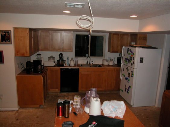
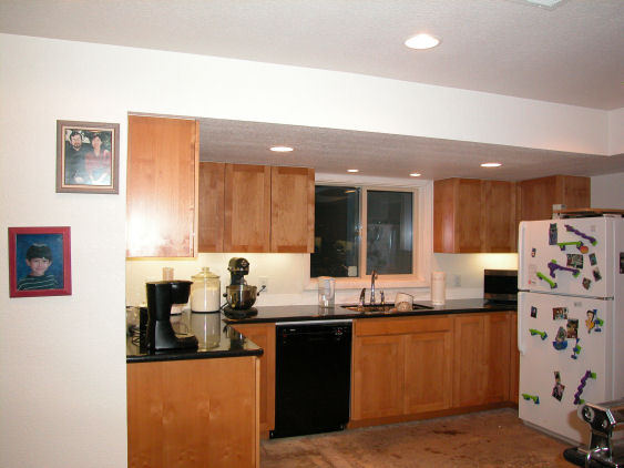
and after:
Before:
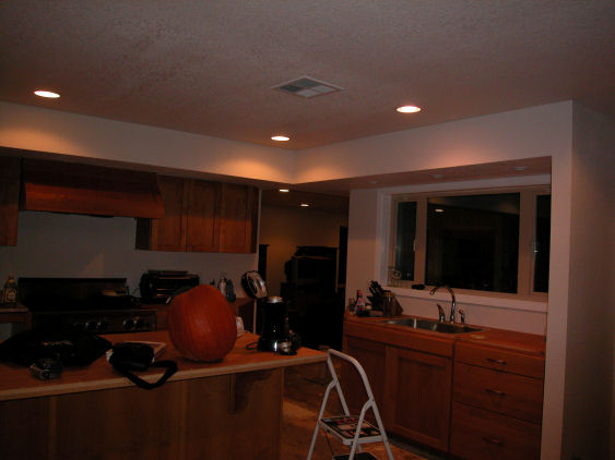
and after:
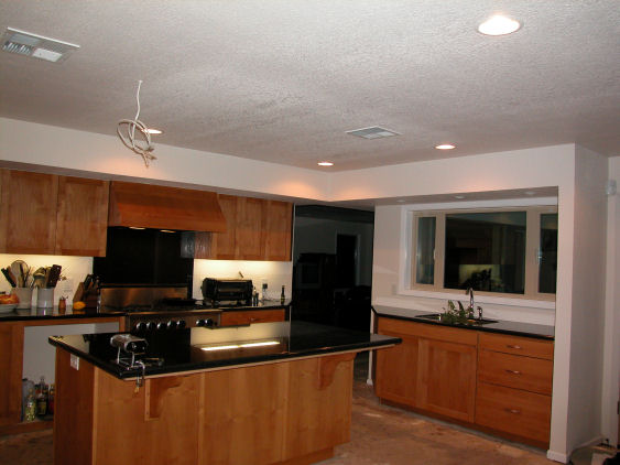
Closeup, with lemons.
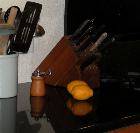
It’s black. Black galaxy? Not Blackity-black Black or Ultra Black or whatever that featureless black is that might as well be Corian. This stuff has silver features.
My mother’s comment when I told her what we had put in: “Black?” Like no one in his right mind would put in black granite. But as you can see, it’s a well lit kitchen, and the black goes nicely with the cabinets.
We still need to tile in the walls behind the counters, and the big big job, still to come — the floors. And then maybe we’ll start working on the master bedroom, where my wife and son spend 99% of their waking hours anyway.
D.
PS: rereading this, I see I have committed the typical cosmetic surgeon’s error: I have photographed the “befores” in an unflattering light, while the “afters” got better lighting. Oh, well!
And here I was thinking you added some really kickass lighting …
I like the black, especially with the wood. My late ex-mother-in-law had black counters with white cabinets, which was a bit stark.
I particularly like the noose you’ve had put in (pic 4) in case your cooking is to die for.
(sniggers)
Oooooh…. drool, envy….
Gorgeous!
I love granite counters. Never had any.
Maybe someday!
that’s not a mistake, it’s what you’re supposed to do. If the kitchen were female you’d put make up on her for the after picture. And do something about her hair.
Lovely lovely kitchen. Mmmmmenvy is a bad thing.
The window treatment over the sink is a HUGE improvement, and granite countertops are the way to go. I am sorry I didn’t go that route in our kitchen over the $6,000 we spent on those f-ing shutters that turned yellow even after they replaced them when they turned the first time. Sigh. Even in a new house, there are woes. And…you know our mother and the color black…
It looks nice! Much better.
I have mixed feelings about granite, and my objections are silly. I don’t like the sound that glasses make when you put them down on granite. Some granite has small voids in it, and I don’t like them: countertops should be smooth. Yes, these are stupid objections. On the other hand, I like that you can slap a hot pot down anywhere without worrying.
I think black is a great choice. It’ll show every crumb, so you can get it really clean.
sxK: good thing we didn’t have white cabinets, because then we would have wanted the blue-black granite, which is the most expensive type.
microsoar: the noose is the wiring for the as-yet-nonexistent light fixture over the island. We want something like this (only with squat conical fixtures . . . cobalt blue).
Darla, I seem to recall you writing about your tiny kitchen. Remember, everything is big here in Amerrrka.
Sam, Kate, you’ll get there, you’ll see. Unless you don’t use your kitchens, and then you’d be one of these rich people who has a “show kitchen,” and I know you’re not like that.
Sis, I’m not sure what window treatment you’re talking about. I shot these at night, which is why the windows are black. We don’t have any window treatments downstairs yet — it’s a lower priority than the floors.
Dean, these are sealed. As for it showing everything, I’ll have a photo posted sometime today.
Niiiiiice.
I meant you put in a bigger, better window over the sink. Didn’t you?
Thanks, Jim.
No, same windows, Sis 🙂
See, the counters are so good they make the windows look bigger. 🙂
okay…I must have graded too many essays today…picture one is a square window over the sink, and picture three is more rectangular…or are you playing with my gullibility?
Ah, I see the confusion.
Look more carefully. Pictures 1 and 2 are of the north end of the kitchen. 3 and 4 are from the south end.
Told you it was a humongous kitchen.
It’s gorgeous, Doug! Congrats!
Keep windex handy 😉
Um… two sinks? A spare, just in case?
That is gorgeous