Balls and Walnuts
more than you ever wanted to know
Is this what passes for “controversial” these days?
Blasphemy? I think not.
Clicky clicky to see the full-sized bits.
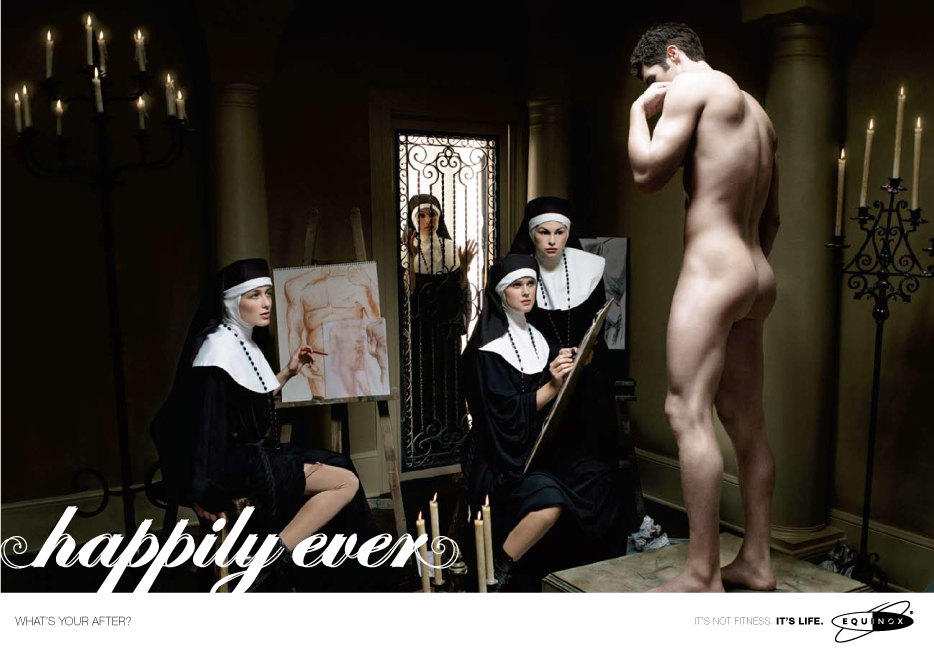
The 20th Century had The Last Temptation and Piss Christ and probably a dozen other books, films, and works of art which surpassed the above image (an ad for a gym, apparently) in outrageousness. Good God, Jesus Dress-Up magnets are more controversial.
Even the non-Catholic leader of the Catholic League, professional curmudgeon and casual twit Bill Donohue, can’t work up much animus towards four nuns and a nude dude.
In any event, this patently stupid ad that Equinox is floating suggests that it must hype its edgy image in order to compete. That’s too bad—apparently their targeted demographic group isn’t lured by the prospect of more barbells and fruit bars. Hence, the need to rip off Catholic imagery in a sophomoric soft-porn ad.
Sophomoric? Meh. I see a poorly composed, overly stylized treatment of an unfocused concept. I fail to see even a filamentous logical connection to physical fitness. This might work as an ad for a men’s fragrance, but even then, I’d be unimpressed.
The other ads in this campaign aren’t much better. Sorry, Equinox — I’m underwhelmed.
D.
The nuns look bored, except for the one actively drawing, who appears to be squinting to try to see something that’s very small. Not exactly a great ad for fitness.
And what’s up with the stockings on the woman to the far left? They’re all bunched up.
I guess what bugs me the most is the way this ad so thoroughly lacks eroticism. It’s almost as if they truly had a borderline-dangerous concept, then set about to tame it down as much as possible (by controlling the postures and expressions of the women).
I would have chosen older nuns and put a hungry look in their eyes.
You’re right, they’re poor ads. I wouldn’t have guessed what was being advertised from the images, and I certainly wouldn’t have made the connection to a gym. I don’t know that I would have made any sort of connection at all.
This is erotic only to those people who confuse nudity with sex. It is dull.
The “Table” ad looks like it’s advertising a gymnastics club for the elite of the 17th century.
For the record, the previous sxKitten comment was actually Dean. I would have said something more along the lines of “Nice ass.”
The ads would be more realistic if the nuns had rulers.
I think the ad is interesting, though not erotic. It makes you take a look to try to figure out what is going on.
Oh, I love it: four stern-looking nuns holding rulers in front of the naked guy! Brilliant.
sxKitten: to Dean’s credit, I was sure that was you.
Dean: when I wrote “sxKitten” just now, I meant “Dean.”
Pat: I thought “Table” had the poorest composition of all. What a mess. For what it’s worth, I liked that last one the best, mostly because it’s so unusual to see a sexy older woman featured in an ad.
Check out these ads for Tom Ford Cologne for Men – one of them is the closest thing to porn that I’ve seen in mainstream magazines (admittedly we are talking men’s fashion magazines, to which my husband subscribes and which I read for the articles – really).
http://commercial-archive.com/node/139899
http://imaginginsider.com/?p=54117
Also found these sexy French perfume ads, when trying to find the above. Very nice! Much nicer than the crass, oily imagery above – IMHO.
http://www.youtube.com/watch?v=qydckxM4Y-M
http://www.youtube.com/watch?v=yXAH8lLGQqg&NR=1
The campaign in your post has a certain jejeune charm, but as noted is a bit limited in the execution. Concur the last one with the b-day cake is the best.