Balls and Walnuts
more than you ever wanted to know
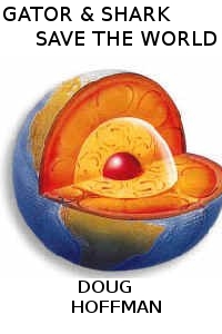
Current status of the cover, in 200 x 300 pixels
There’s a reason why a lot of books have short, one-word titles, with simple covers. They need to look great as teensy thumbnails. (Check out the thumbnails at the bottom of this semi-randomly chosen page.) With this in mind, my designer has kindly been tweaking his cover to provide something that looks good when scaled down. Here’s 200 x 305 pixels:

Gator & Shark Save the World
And at half that size,

Gator & Shark Save the World
Even in this tiny format, the author by-line and titles are all clear. Can’t make out much of the detail of the figures, unfortunately. Live and learn: I asked for a group tableau, and that’s what I got. I like my cover, though, and I really do think something like this would have been much more dull.

Yes, the graphic is relevant. You’ll have to read the book if you want to know why.
D.